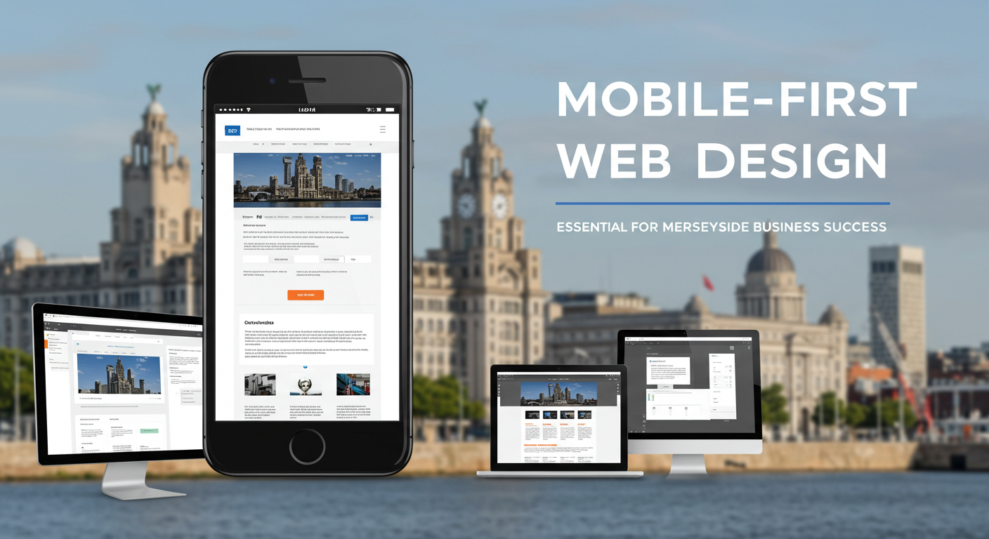
Mobile-First Web Design: Why Your Merseyside Business Can’t Afford to Wait
In 2025, if your Merseyside business website isn’t optimized for mobile devices, you’re not just losing customers—you’re actively pushing them toward your competitors. With mobile devices accounting for over 60% of all UK web traffic, mobile-first design has shifted from a nice-to-have feature to a business necessity.
For Liverpool and Merseyside businesses competing in an increasingly digital marketplace, understanding and implementing mobile-first web design principles isn’t optional anymore. It’s the difference between thriving and merely surviving in today’s mobile-dominated landscape.
The Mobile Reality: Statistics That Matter for Merseyside Businesses
The numbers tell a compelling story that no business owner can afford to ignore:
62% of UK internet users access the web primarily through mobile devices in 2025, with this figure climbing to 68% among younger demographics—exactly the audience driving Liverpool’s thriving digital economy. (Source: Ofcom Communications Market Report)
More importantly for local businesses, research shows that 76% of consumers who search for something nearby on their smartphone visit a related business within 24 hours, and 28% of those searches result in a purchase. For Merseyside businesses—whether you’re a Bold Street boutique, a Liverpool waterfront restaurant, or a Wirral professional services firm—this represents significant opportunity.
Google’s mobile-first indexing means your mobile site now determines your search engine ranking. If your mobile experience is poor, your visibility in search results suffers—regardless of how impressive your desktop site might be.
Perhaps most striking: 53% of mobile users abandon websites that take longer than three seconds to load. In Liverpool’s competitive business environment, where customers have dozens of alternatives at their fingertips, every second of loading time directly impacts your bottom line.

What Is Mobile-First Design? Understanding the Fundamentals
Mobile-first design represents a fundamental shift in how websites are conceived and built. Rather than designing a full-featured desktop website and then trying to squeeze it into smaller screens, mobile-first design starts with the mobile experience and progressively enhances it for larger screens.
Mobile-First vs. Responsive Design: Understanding the Difference
Responsive design means your website adjusts to different screen sizes. It’s typically built desktop-first, with CSS media queries that adapt the layout for smaller screens. While responsive design ensures your site works on mobile devices, it often results in bloated code and compromised mobile performance. Learn more about responsive web design principles at MDN Web Docs.
Mobile-first design inverts this approach. You start by designing for the smallest screen and most constrained environment first, then progressively add features and complexity for larger screens with more capabilities. This approach forces you to prioritize content and functionality, resulting in faster load times, cleaner code, and better user experiences across all devices.
Key Distinction: Responsive design adapts existing desktop sites for mobile. Mobile-first design builds from mobile upward, ensuring the mobile experience is never an afterthought.
Core Principles of Mobile-First Thinking
Mobile-first design isn’t just about screen size—it’s about understanding context, constraints, and user behavior:
- Content prioritization: Limited screen space forces you to identify what truly matters to your users
- Performance focus: Mobile users often have slower connections, making speed optimization critical
- Touch-first interaction: Designing for fingers rather than mouse pointers changes interface requirements
- Progressive enhancement: Starting simple and adding complexity only where beneficial (read about progressive enhancement at Smashing Magazine)
- Context awareness: Mobile users are often on-the-go, requiring different information and functionality
Why Mobile-First Matters for Merseyside Businesses
Liverpool and the wider Merseyside region have experienced remarkable digital transformation. From the thriving Baltic Triangle tech scene to established businesses across Wirral, Sefton, and Knowsley, local companies face unique opportunities and challenges in the mobile era.
Local Search and Mobile Discovery
Merseyside’s vibrant tourism industry, bustling retail sector, and growing professional services market all depend heavily on mobile discovery. When visitors search for “restaurants near Liverpool ONE” or “accountants in Wirral,” they’re overwhelmingly doing so on mobile devices.
A mobile-first website ensures you’re not just found—you’re chosen. Fast loading times, clear navigation, and easy-to-use contact features mean the difference between a search result and a customer walking through your door.
Competitive Advantage in a Digital Economy
Liverpool’s business landscape is increasingly competitive. Whether you’re competing against established brands or nimble startups, your mobile experience directly impacts customer perception of your professionalism and reliability.
Consider this: when a potential customer compares three businesses on their smartphone while standing on Church Street, the one with the fastest, clearest mobile experience typically wins—regardless of who might objectively offer the best service.
Supporting Merseyside’s Mobile-Heavy Demographics
Liverpool boasts a young, digitally-savvy population, with five universities contributing to a demographic that expects seamless mobile experiences. Additionally, tourists visiting the city’s attractions—from the waterfront to the football stadiums—rely almost exclusively on mobile devices for discovery and navigation.
A mobile-first approach ensures you’re accessible to both local customers and the millions of annual visitors contributing to Merseyside’s economy.
The Business Cost of Not Being Mobile-Friendly
Ignoring mobile-first design doesn’t just mean missing opportunities—it actively damages your business in measurable ways.
Lost Revenue and Customer Abandonment
Research from Sweor’s mobile statistics report shows that 57% of users won’t recommend a business with a poorly designed mobile site, and 40% will turn to a competitor instead. For a Merseyside business with even modest web traffic, this translates to thousands of pounds in lost revenue annually.
Consider a Liverpool restaurant that receives 1,000 mobile visitors per month. If 40% abandon due to poor mobile experience, that’s 400 potential customers lost every month—4,800 per year. Even if only 10% would have converted to bookings, you’ve lost 480 customers who went to competitors instead.
Search Engine Invisibility
Since Google’s mobile-first indexing update, your mobile site is your primary site in Google’s eyes. A poor mobile experience directly impacts your search rankings, creating a vicious cycle: bad mobile experience leads to lower rankings, which leads to less traffic, which further impacts your business.
For Merseyside businesses competing for local search visibility, this can mean the difference between appearing on page one or page three of search results—and we all know nobody looks past page one.
Damaged Brand Perception
Your website is often the first impression customers have of your business. A clunky, slow, or difficult-to-use mobile site communicates that your business is outdated, unprofessional, or doesn’t care about customer experience.
In Liverpool’s image-conscious markets—from hospitality to professional services—this perception can be impossible to overcome, regardless of how excellent your actual service might be.
Key Principles of Mobile-First Design
Implementing mobile-first design successfully requires understanding and applying several core principles:
1. Content Prioritization and Progressive Disclosure
Mobile screens force ruthless prioritization. You must identify the most important content and actions for your users and present them prominently, while secondary information can be progressively disclosed through expandable sections or separate pages.
For a Merseyside estate agent, this might mean prominently displaying property search functionality and phone contact on mobile, while detailed area guides and company history remain accessible but not immediately visible.
2. Performance Optimization
Mobile-first means performance-first. Key strategies include:
- Image optimization: Serving appropriately sized images based on device capabilities
- Lazy loading: Loading content only as users scroll to it
- Minimal dependencies: Reducing the number of external scripts and stylesheets
- Efficient code: Removing unnecessary complexity and bloat
- Content delivery networks: Serving assets from locations closer to users
A well-optimized mobile-first site should load core content in under two seconds, even on 4G connections.
3. Touch-Friendly Interface Design
Fingers are less precise than mouse pointers, requiring larger touch targets and appropriate spacing:
- Minimum touch target size: 44×44 pixels for interactive elements (W3C accessibility guidelines)
- Adequate spacing: Preventing accidental taps on adjacent elements
- Clear feedback: Visual confirmation when elements are tapped
- Simplified forms: Minimizing typing requirements and using appropriate input types
- Thumb-friendly navigation: Placing key controls within easy reach
4. Simplified Navigation
Desktop navigation patterns often fail on mobile. Mobile-first design requires rethinking navigation entirely:
- Prioritize the most important sections in your navigation
- Use clear, concise labels that users understand immediately
- Implement patterns users recognize, like hamburger menus or bottom navigation bars
- Ensure navigation is always accessible but doesn’t dominate the screen
- Consider context-specific navigation based on user journey
5. Readable Typography and Hierarchy
Text readability on small screens requires careful attention:
- Base font size: Minimum 16 pixels to prevent forced zooming
- Line height: 1.5 to 1.6 for comfortable reading
- Line length: 50-75 characters for optimal readability
- Sufficient contrast: Ensuring text is readable in various lighting conditions
- Clear hierarchy: Using size, weight, and spacing to guide users through content
6. Contextual Functionality
Mobile users have different needs and contexts than desktop users. Mobile-first design considers these differences:
- Prominent “click to call” buttons for easy phone contact
- Integrated maps with one-tap directions
- Location-aware features that adapt content based on user location
- Quick actions for common tasks (booking, ordering, contacting)
- Offline functionality where appropriate
For a Liverpool-based business, this might mean highlighting your L1 postcode prominently, integrating directions to nearby landmarks like Liverpool ONE or Lime Street Station, and providing instant booking or callback request options.

How to Transition Your Existing Website to Mobile-First
If your current website wasn’t built with mobile-first principles, transitioning requires strategic planning and execution. Here’s a practical roadmap for Merseyside businesses:
Step 1: Audit Your Current Mobile Performance
Before making changes, understand where you stand:
- Use Google’s Mobile-Friendly Test to identify immediate issues
- Analyze mobile traffic patterns in Google Analytics
- Test your site on actual mobile devices (not just browser emulators)
- Review mobile user behavior—where do they drop off?
- Check page load speeds using Google PageSpeed Insights
This audit provides baseline metrics and identifies the most critical problems impacting your business.
Step 2: Prioritize Content and Functionality
Work with your team to identify what truly matters to mobile users:
- What are the top three reasons people visit your site?
- What actions do you want mobile users to take?
- What information is essential versus nice-to-have?
- Which features are used most frequently on mobile?
This prioritization exercise forces difficult decisions but results in a clearer, more effective mobile experience.
Step 3: Redesign with Mobile as Primary
Rather than retrofitting your existing desktop site, approach this as a fresh design challenge:
- Start with mobile wireframes that focus on prioritized content
- Design for touch interaction from the beginning
- Optimize images and media for mobile consumption
- Simplify forms and reduce input requirements
- Test designs on actual devices throughout the process
Step 4: Implement Progressive Enhancement
Once your mobile design is solid, enhance it for larger screens:
- Add additional content and features that benefit from more space
- Introduce more complex interactions suited to mouse and keyboard
- Expand visual elements while maintaining core functionality
- Consider multi-column layouts where appropriate
- Enhance navigation patterns for desktop users
The key is ensuring the core experience remains consistent—tablet and desktop versions should feel like natural extensions of the mobile experience, not different websites.
Step 5: Optimize Performance Ruthlessly
Mobile-first design means performance-first:
- Compress and optimize all images (consider WebP format)
- Minify CSS and JavaScript files
- Implement lazy loading for images and non-critical content
- Reduce third-party scripts to absolute essentials
- Enable browser caching and gzip compression
- Consider a content delivery network (CDN) for faster asset delivery
Target page load times of under two seconds on 4G connections—every 100 milliseconds of improvement increases conversion rates.
Step 6: Test Extensively Across Devices
Before launch, comprehensive testing is critical:
- Test on actual devices, not just emulators (iPhone, Android, tablets)
- Verify functionality across different browsers (Chrome, Safari, Firefox)
- Test on various connection speeds, including slower 3G
- Involve actual users in testing—their feedback is invaluable
- Check analytics to ensure tracking works correctly on mobile
Step 7: Monitor, Measure, and Iterate
Launch is just the beginning. Continuous improvement requires ongoing attention:
- Monitor mobile analytics for user behavior patterns
- Track mobile conversion rates and key performance indicators
- Gather user feedback through surveys or customer service interactions
- Test design variations to optimize conversion rates
- Stay current with mobile trends and user expectations
Working with Professional Web Designers
For many Merseyside businesses, transitioning to mobile-first design is best accomplished with professional support. Experienced web designers bring:
- Technical expertise: Understanding of modern development frameworks and optimization techniques
- Design experience: Knowledge of mobile interface patterns and user expectations
- Strategic perspective: Ability to balance business goals with user needs
- Efficiency: Avoiding costly mistakes and ensuring proper implementation
- Ongoing support: Maintenance and updates as mobile technology evolves
When selecting a web design partner for your mobile-first project, prioritize those with demonstrated experience in mobile optimization and a portfolio of fast, user-friendly sites.

The Future Is Mobile—And It’s Already Here
For Merseyside businesses, mobile-first design isn’t about preparing for the future—it’s about competing effectively in the present. With mobile devices dominating web traffic, voice search gaining prominence, and user expectations constantly rising, the question isn’t whether to embrace mobile-first design, but how quickly you can implement it.
The competitive advantage goes to businesses that recognize this reality and act decisively. A mobile-first website doesn’t just serve mobile users better—it typically improves the experience for all users through its focus on speed, simplicity, and user-centered design.
Remember: Every day your website isn’t optimized for mobile is a day you’re losing customers to competitors who understand the mobile-first imperative. The cost of inaction far exceeds the investment in proper mobile optimization.
Liverpool and Merseyside businesses have always thrived through innovation and adaptation. Mobile-first design represents the next essential evolution in how you connect with customers, build your brand, and grow your business in an increasingly mobile world.
Ready to Transform Your Mobile Experience?
L1 Web Tips specializes in creating fast, user-friendly, mobile-first websites for Liverpool and Merseyside businesses. We understand the local market, your customers’ needs, and the technical requirements for success in mobile search.
Our mobile-first approach ensures your website doesn’t just work on mobile devices—it excels, providing the fast, intuitive experience that converts visitors into customers.
Contact us today for a comprehensive mobile performance audit and discover how mobile-first design can transform your online presence and drive real business results.


